Content Management System
Content Management System
Content Management System
Lead Product Designer: UX, UI, Strategy, Research & Design System
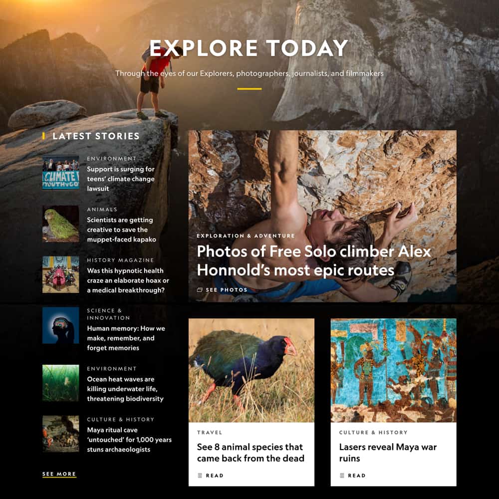
At National Geographic’s publishing core, lives our content management system. In 2018, we began deep-diving into research, stakeholder interviews, and creating new designs for a brand new CMS – to make writing and publishing content easier than ever.
Research
Research
Research
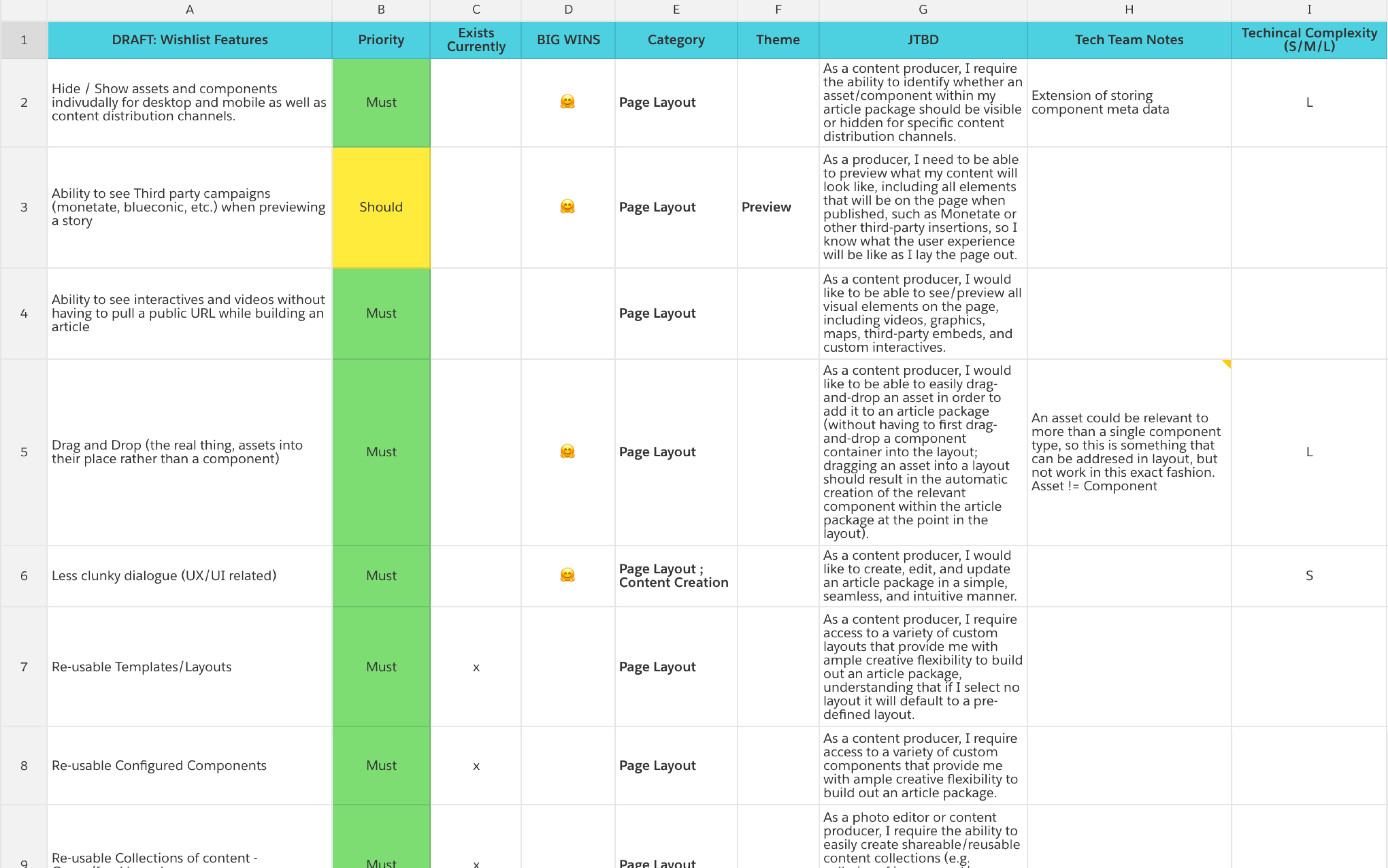
The team selected a group of key representatives from a variety of disciplines throughout National Geographic and held 15 group stakeholder interviews to determine our key feature set and improvements for launch. These features were broken down and categorized into what could be considered “Big Wins”, and divided into six key categories to ensure alignment and focus across both design and development.
The team selected a group of key representatives from a variety of disciplines throughout National Geographic and held 15 group stakeholder interviews to determine our key feature set and improvements for launch. These features were broken down and categorized into what could be considered “Big Wins”, and divided into six key categories to ensure alignment and focus across both design and development.
The team selected a group of key representatives from a variety of disciplines throughout National Geographic and held 15 group stakeholder interviews to determine our key feature set and improvements for launch. These features were broken down and categorized into what could be considered “Big Wins”, and divided into six key categories to ensure alignment and focus across both design and development.
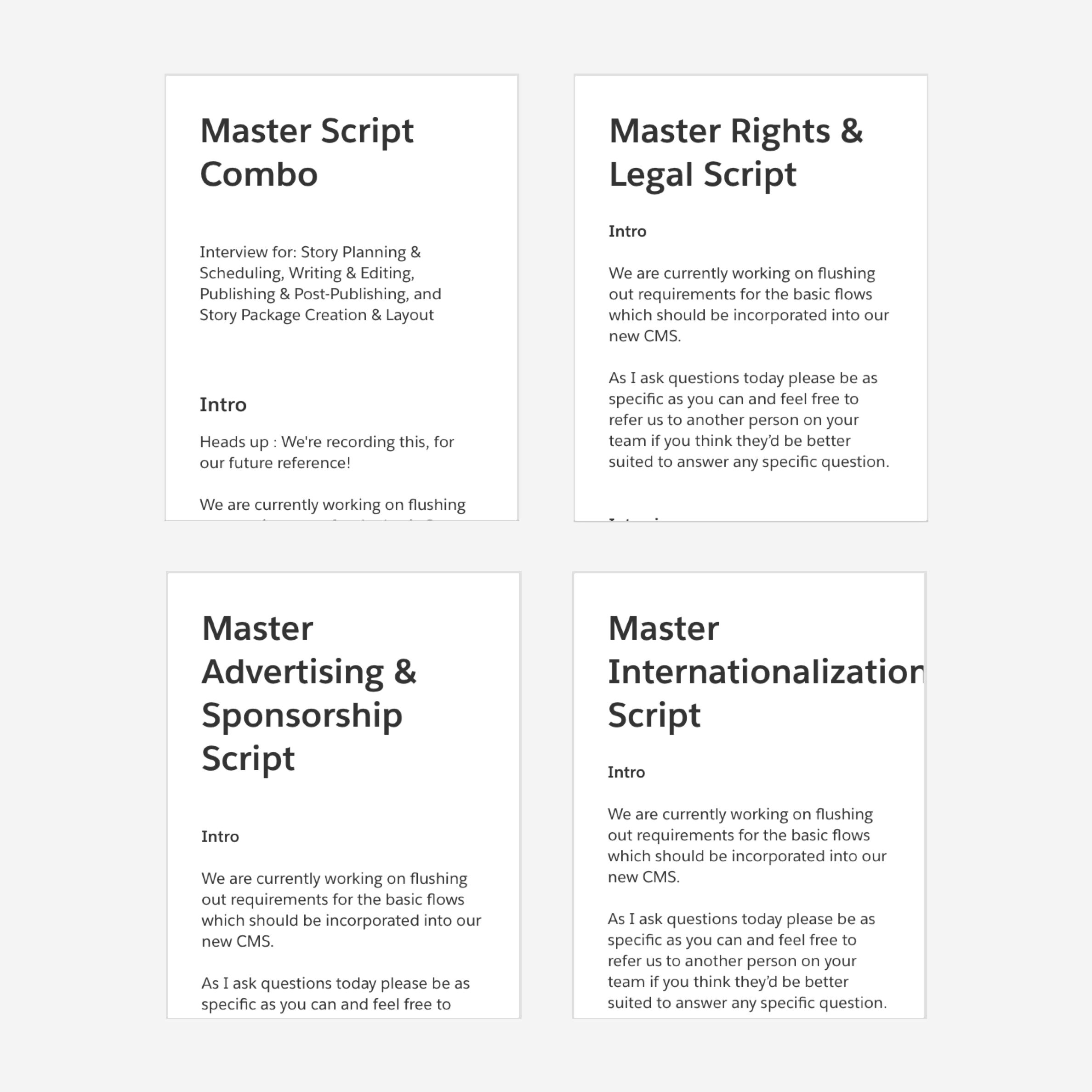
Interview Scripts
In order to identify key features and deliverables, we created four master scripts to interview a variety of stakeholders – Rights and Legal, Internationalization, Advertising and Sponsorship, and a more general producing/publishing combination script. These scripts allowed us to dive further into the more complex content areas of our workflows, but also utilize a script that was more easily applied to everyone. All interviews were done in person, and recorded in order to create a breakdown of further notes after each session.
Interview Scripts
In order to identify key features and deliverables, we created four master scripts to interview a variety of stakeholders – Rights and Legal, Internationalization, Advertising and Sponsorship, and a more general producing/publishing combination script. These scripts allowed us to dive further into the more complex content areas of our workflows, but also utilize a script that was more easily applied to everyone. All interviews were done in person, and recorded in ordre to create a breakdown of further notes after each session.
Design Process
Design Process
Design Process
After identifying the feature breakdown and creating an initial roadmap with the product team, we divided the design work into six groups – 1) content creation, search and asset management, 2) templates, 3) content preview and publishing, 4) reporting and analytics, 5) UI for all previous groups, and 6) refinements to asset management and reusable modules.
After identifying the feature breakdown and creating an intial roadmap with the product team, we divided the design work into six groups – 1) content creation, search and asset management, 2) templates, 3) content preview and publishing, 4) reporting and analytics, 5) UI for all previous groups, and 6) refinements to asset management and reusable modules.
After identifying the feature breakdown and creating an initial roadmap with the product team, we divided the design work into six groups – 1) content creation, search and asset management, 2) templates, 3) content preview and publishing, 4) reporting and analytics, 5) UI for all previous groups, and 6) refinements to asset management and reusable modules.
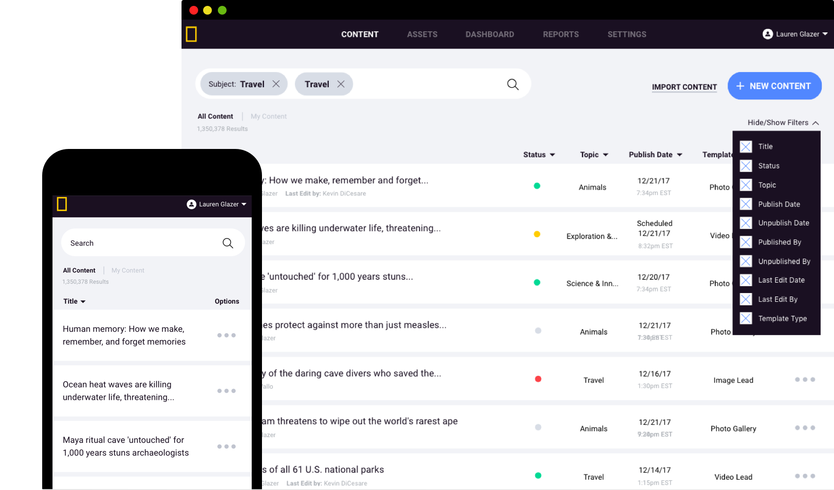
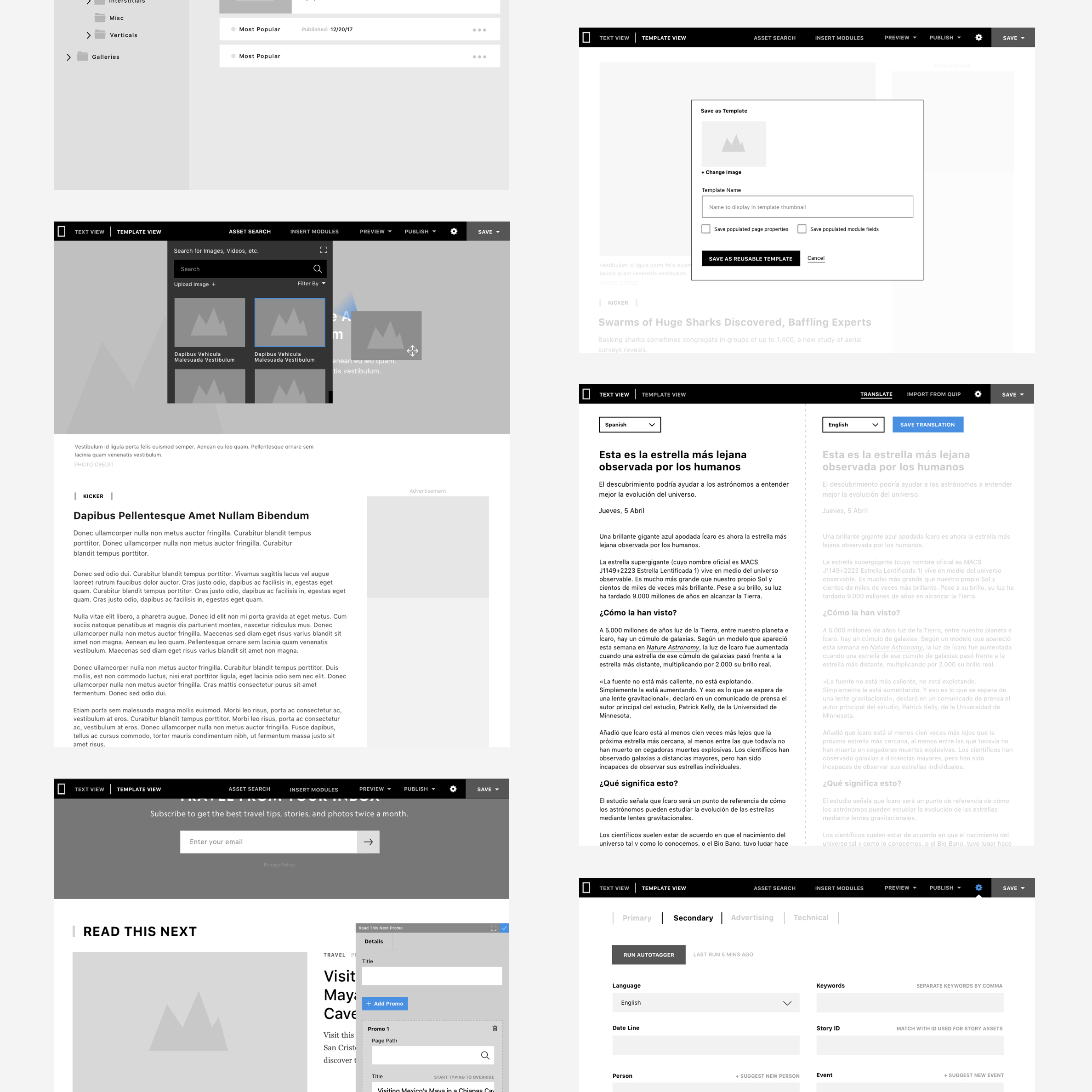
Wireframes
By starting with wireframes, we were able to present interactive prototypes to stakeholders, utilizing keynote and InVision, in order to demo workflows and functionality of the new CMS before diving into the UI.
Wireframes
By starting with wireframes, we were able to present interactive prototypes to stakeholders, utilizing keynote and InVision, in order to demo workflows and functionality of the new CMS before diving into the UI.
Wireframes
By starting with wireframes, we were able to present interactive prototypes to stakeholders, utilizing keynote and InVision, in order to demo workflows and functionality of the new CMS before diving into the UI.
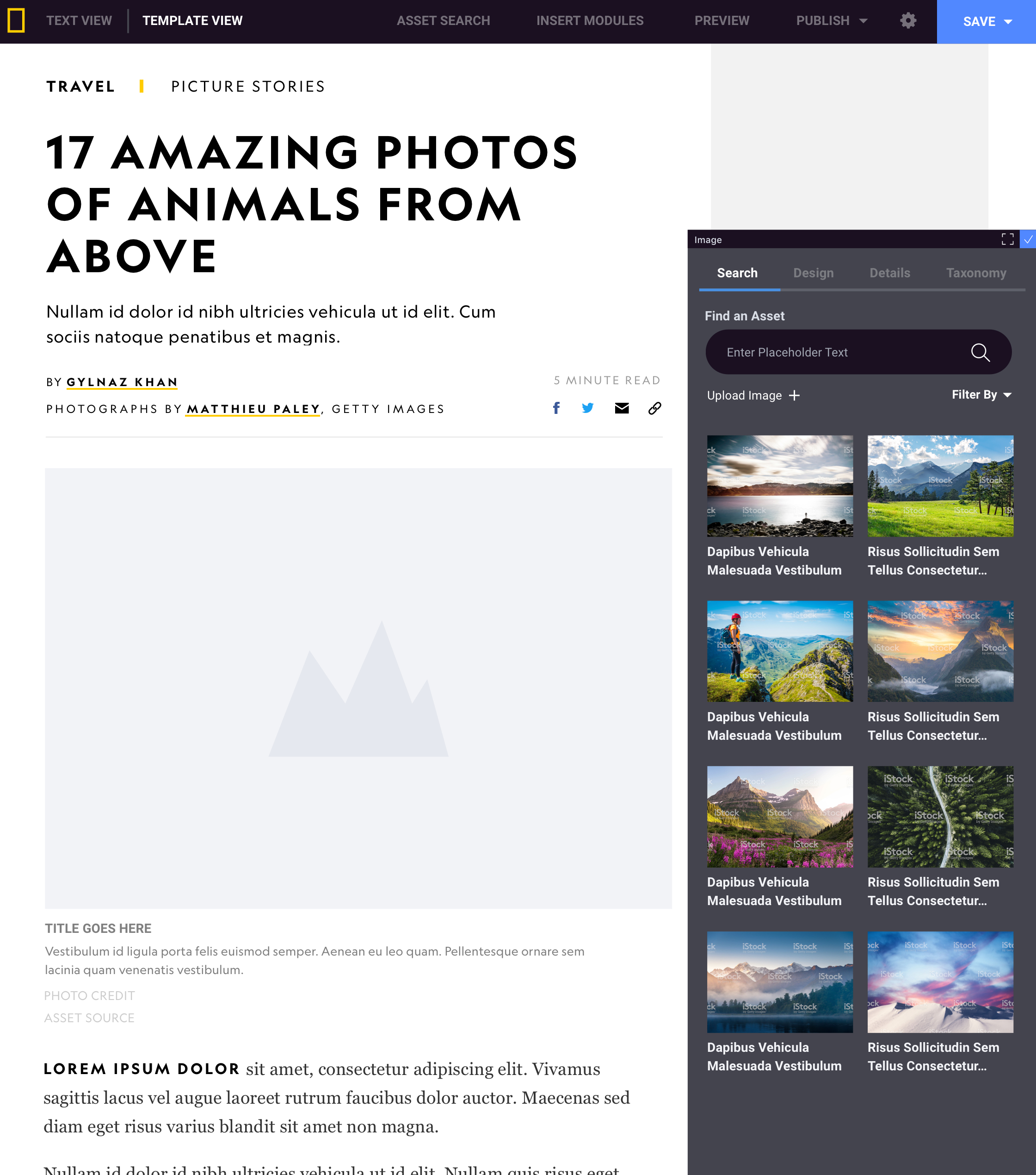
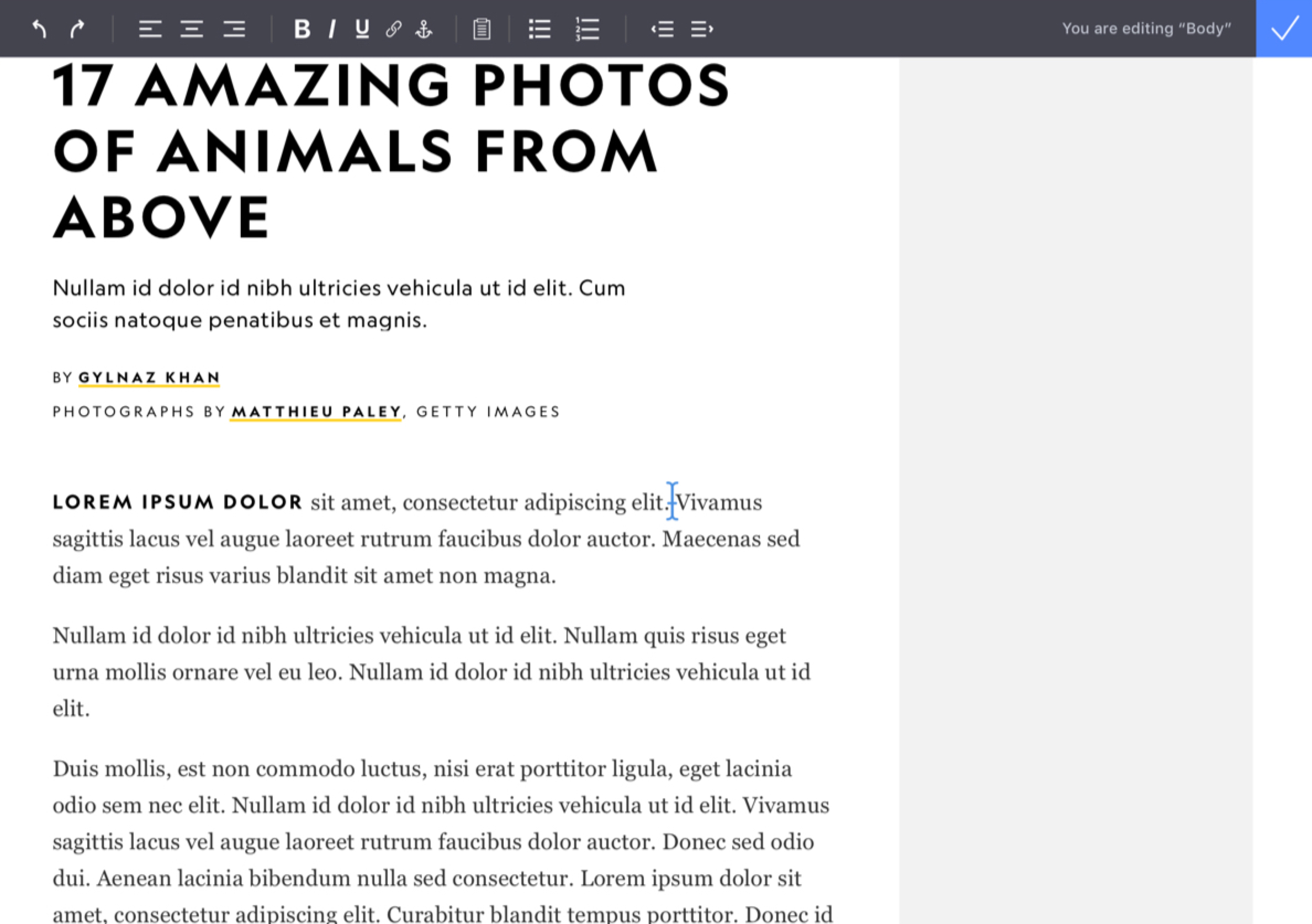
UI Exploration
Since content creation is the star of the show, we wanted to create a UI that helped highlight the experience of using the new CMS, while not overpowering the workflows. We went to Google fonts, leaning on Roboto for easily legible utilities and functions, and to create a visual difference during content preview. We also chose colors that provided a focus on actions, but differentiated from the colors used across our digital content platforms for clearer preview purposes.
UI Exploration
Since content creation is the star of the show, we wanted to create a UI that helped higlight the experience of using the new CMS, while not overpowering the workflows. We went to google fonts, leaning on Roboto for easily legible utilities and functions, and to create a visual difference during content preview. We also chose colors that provided a focus on actions, but differentiated from the colors used across our digital content platforms for clearer preview purposes.
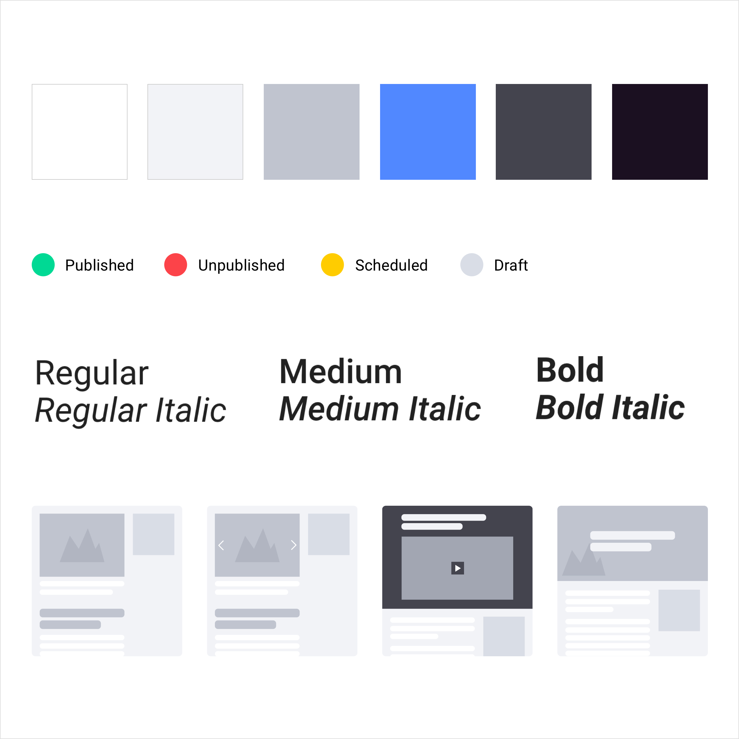
Defining a System
With a fast timeline and roadmap, it was crucial to design a system that could be quickly reused and applied across hundreds of screens. In order to do so, I developed a categorized styleguide within Sketch, utilizing symbols. After all symbols had been categorized and saved, it created a quick and seamless way to being applying the UI to all of the user flows we had determined. This also allowed for a natural transition into Zeplin, which provided the developers with a way to quickly digest all of the modules, colors, typography, and user flows in one location.
Defining a System
With a fast timeline and roadmap, it was crucial to design a system that could be quickly reused and applied across hundreds of screens. In order to do so, I developed a cateogrized styleguide within Sketch, utilzing symbols. After all symbols had been categorized and saved, it created a quick and seamless way to being applying the UI to all of the user flows we had determined. This also allowed for a natural transition into Zeplin, which provided the developers with a way to quickly digest all of the modules, colors, typography, and user flows in one location.
Defining a System
With a fast timeline and roadmap, it was crucial to design a system that could be quickly reused and applied across hundreds of screens. In order to do so, I developed a categorized styleguide within Sketch, utilizing symbols. After all symbols had been categorized and saved, it created a quick and seamless way to being applying the UI to all of the user flows we had determined. This also allowed for a natural transition into Zeplin, which provided the developers with a way to quickly digest all of the modules, colors, typography, and user flows in one location.
Results
Results
Results
Below are the six big wins we identified and began building features towards. These features will be tested in a sandbox development environment with the same stakeholder groups we held interviews with, in order to understand our success in implementing an enhanced UX and providing features that are quick and simple for producers to use.
Below are the six big wins we identified and began building features towards. These features will be tested in a sandbox development environment with the same stakeholder groups we held interviews with, in order to understand our success in implementing an enhanced UX and providing features that are quick and simple for producers to use.
Below are the six big wins we identified and began building features towards. These features will be tested in a sandbox development environment with the same stakeholder groups we held interviews with, in order to understand our success in implementing an enhanced UX and providing features that are quick and simple for producers to use.
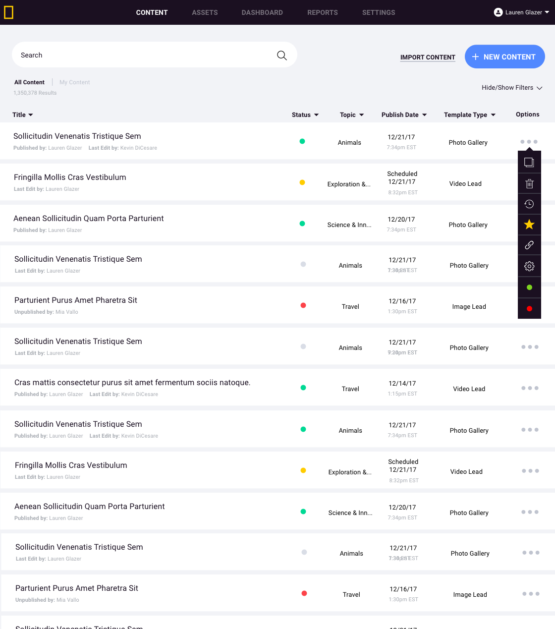
Intuitive
With features like drag and drop, tag based searching and inline editing, we focused on keeping the content creation process as simple and easy-to-use as possible.
Intuitive
With features like drag and drop, tag based searching and inline editing, we focused on keeping the content creation process as simple and easy-to-use as possible.
Intuitive
With features like drag and drop, tag based searching and inline editing, we focused on keeping the content creation process as simple and easy-to-use as possible.
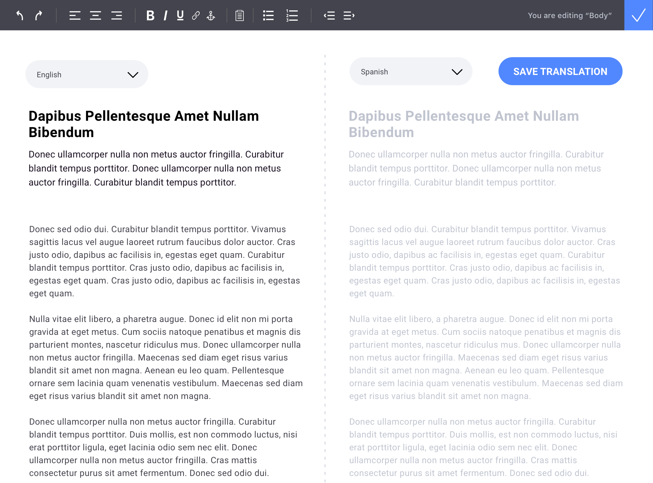
Fast
While the dev team is prioritizing performance for significant improvements on the back end, we also wanted to build features like side-by-side translation, that created speedier workflows and improved usability of the system.
Fast
While the dev team is prioritizing performance for significant improvements on the back end, we also wanted to build features like side-by-side translation, that created speedier workflows and improved usability of the system.
Fast
While the dev team is prioritizing performance for significant improvements on the back end, we also wanted to build features like side-by-side translation, that created speedier workflows and improved usability of the system.
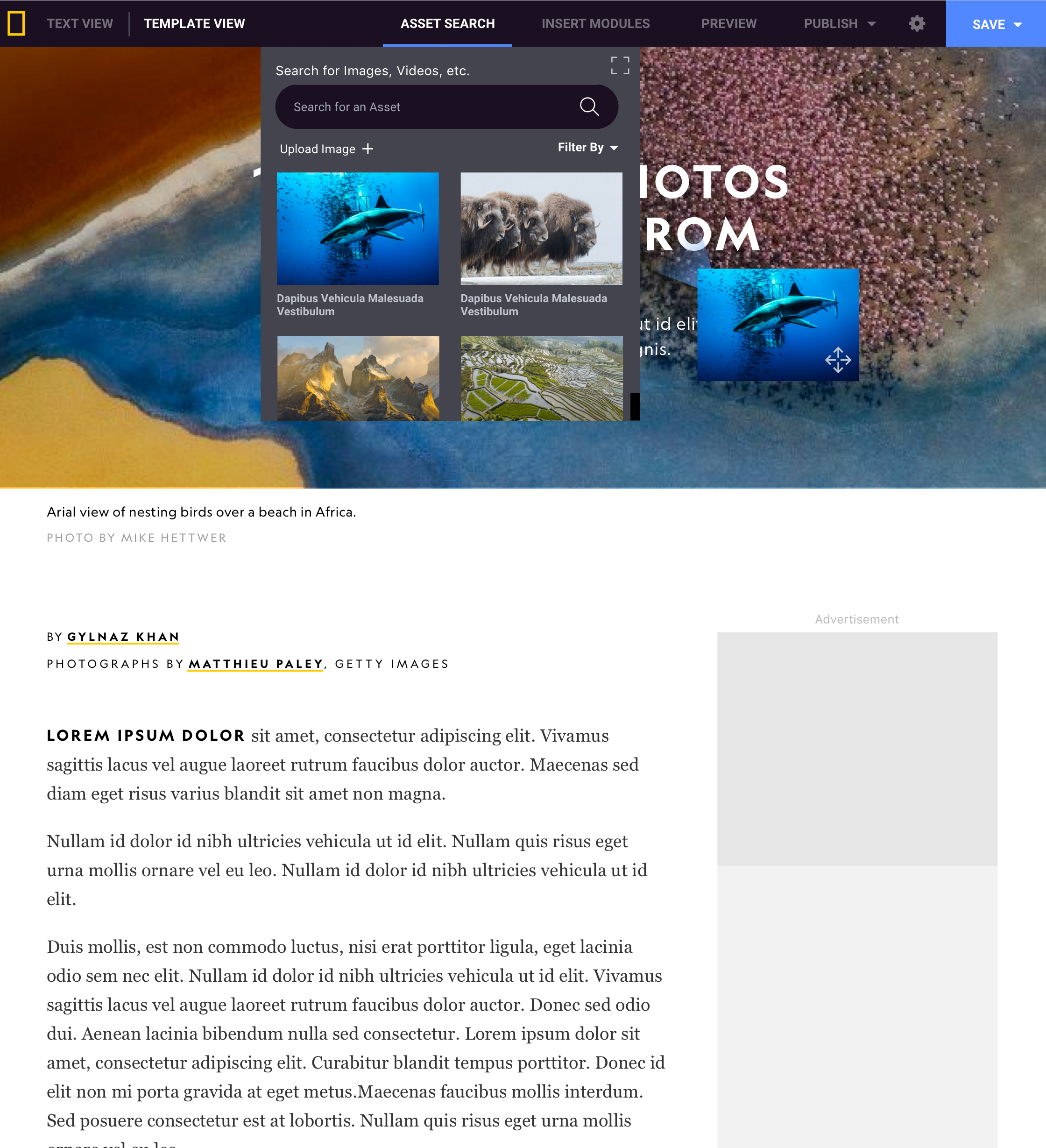
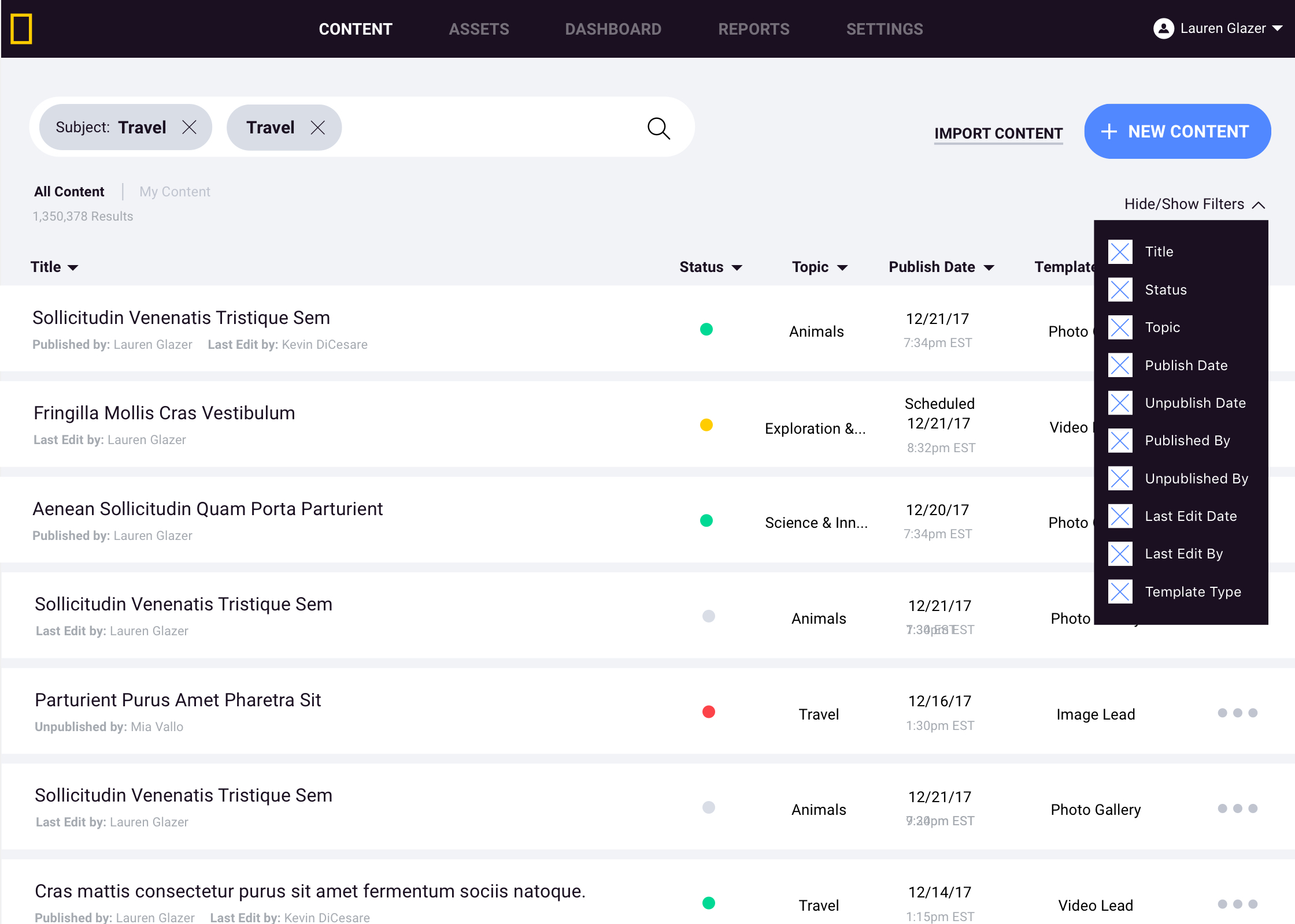
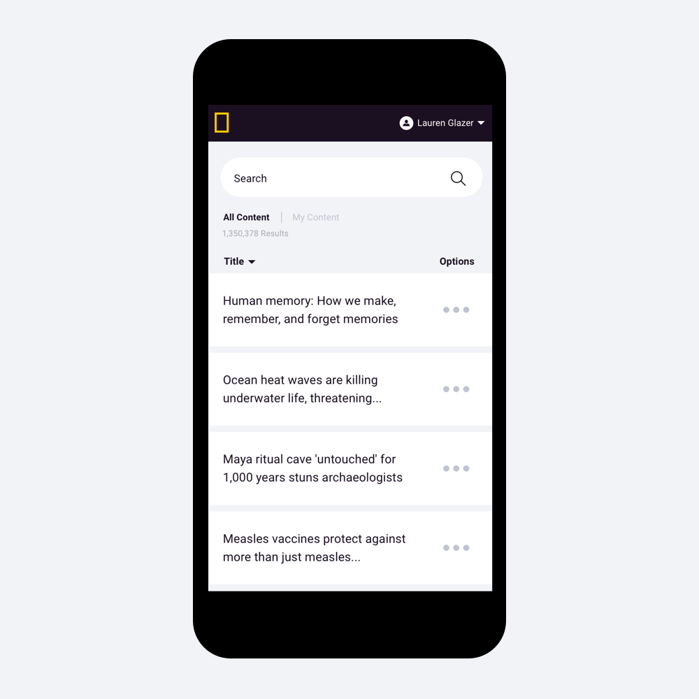
Robust Search
In addition to allowing search by our custom taxonomy system within all areas of the CMS, users can search by common language terms, and lean on the powerful sort / filter options to continue to narrow down their search.
Robust Search
In addition to allowing seach by our custom taxonomy system within all areas of the CMS, users can search by common language terms, and lean on the powerful sort / filter options to continue to narrow down their search.
Robust Search
In addition to allowing search by our custom taxonomy system within all areas of the CMS, users can search by common language terms, and lean on the powerful sort / filter options to continue to narrow down their search.
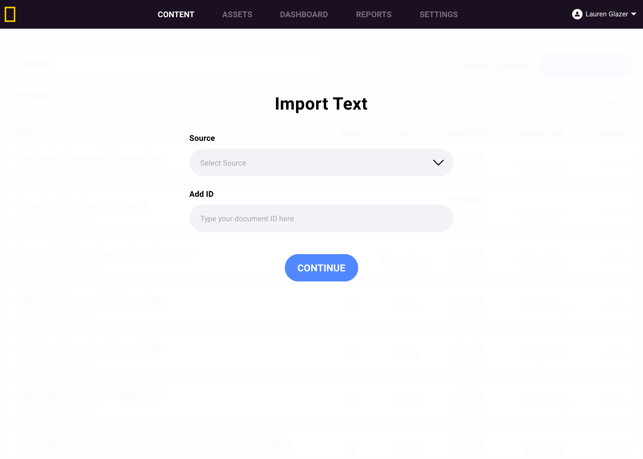
Import
Many of our editors were writing in a variety of text editors, which often causes formatting issues when copying and pasting into a CMS. Rather than continue that workflow, we established a simple integration with Quip, to allow for a clean and simple text import.
Import
Many of our editors were writing in a variety of text editors, which often causes formatting issues when copying and pasting into a CMS. Rather than continue that workflow, we established a simple integration with quip, to allow for a clean and simple text import.
Import
Many of our editors were writing in a variety of text editors, which often causes formatting issues when copying and pasting into a CMS. Rather than continue that workflow, we established a simple integration with quip, to allow for a clean and simple text import.
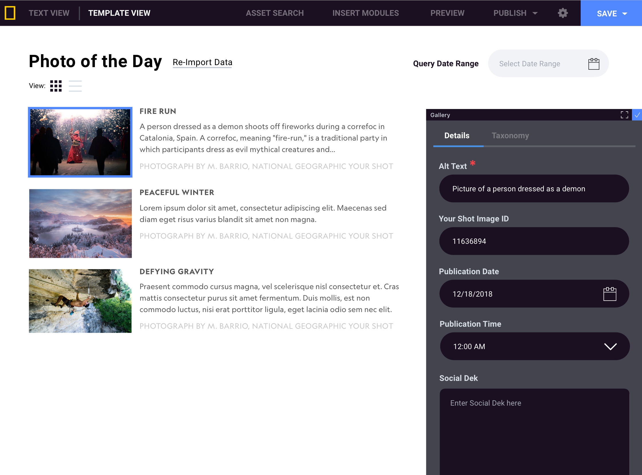
Integration
In addition to allowing for imported text to start the writing process, we also took a look at simplifying our process for Photo of the Day, allowing data to be imported directly from Google docs straight into our CMS.
Integration
In addition to allowing for imported text to start the writing process, we also took a look at simplifying our process for Photo of the Day, allowing data to be imported directly from google docs straight into our CMS.
Integration
In addition to allowing for imported text to start the writing process, we also took a look at simplifying our process for Photo of the Day, allowing data to be imported directly from google docs straight into our CMS.
Reliable
With a variety of security methods in place to protect our content, one of the concerns we heard from our stakeholders was making sure their content was saved and accessible at any point. We’ve created a variety of checkpoints to save content along the way, creating a solid version history for producers to access at any time.
CONTINUE EXPLORING


Lauren Glazer
Principal Product Designer
Get In Touch
glazerlar[at]gmail.com
Follow
© 2026 Lauren Glazer