National Geographic Website Re-design
National Geographic Website Re-design
National Geographic Website Re-design
Senior Product Designer: UX, UI, Strategy, Research & User Testing
NationalGeographic.com attracts millions of global visitors each month, with over fifty percent of our traffic coming from mobile. With this at the heart of our redesign, we focused on creating a clear path of exploration for our users, with an improved above-the-fold experience, and an endless feed of content to explore. In close partnership with Kettle, I was embedded as the Lead Designer from National Geographic, working with the team over the course of several months on everything from strategy and testing, to the UX and UI of the site.
To provide focus, we divided the site into 5 categories of work: articles, hubs, homepage, navigation and UI.
2018 W3 Gold Award Winner for Structure & Navigation, Homepage, Branding, and Best Practices

Strategy
Strategy
Strategy
By starting with article pages, we were able to dive deep into our analytics and user flows to understand how our users were coming in, and what parts of the current experience they were interacting with the most. We focused on creating a strategy that led users through content within an endless feed. We envisioned this process most similarly to a pyramid - starting with the most contextually relevant content directly after the article, and widening the path to query broader content with our remaining verticals, utilizing taxonomy to create as much of a personalized feel as possible.
By starting with article pages, we were able to dive deep into our analytics and user flows to understand how our users were coming in, and what parts of the current experience they were interacting with the most. We focused on creating a strategy that led users through content within an endless feed. We envisioned this process most similarly to a pyramid - starting with the most contextually relevant content directly after the article, and widening the path to query broader content with our remaining verticals, utlizing taxonomy to create as much of a personalized feel as possible.
By starting with article pages, we were able to dive deep into our analytics and user flows to understand how our users were coming in, and what parts of the current experience they were interacting with the most. We focused on creating a strategy that led users through content within an endless feed. We envisioned this process most similarly to a pyramid - starting with the most contextually relevant content directly after the article, and widening the path to query broader content with our remaining verticals, utilizing taxonomy to create as much of a personalized feel as possible.
Content Strategy Exploration
Baby Wires
To focus on the user flow and bring our content strategy to life, we started with baby wireframes. These allowed us to illustrate different types of content and general layout suggestions, while guiding stakeholders through the new strategy. We utilized color only to indicate actions and ads, to clearly illustrate the user experience of the new layout.
Testing Methods
Testing Methods
Testing Methods
For each section of work, I used UserTesting.com to run about 4-5 scripted user tests per sprint of work. For each test, we started with wireframes in order to keep users focused on the flow of the pages themselves. After we were happy with the UX, we integrated UI and continued to test and iterate. Each test was run with 5 users, both desktop and mobile.
For each section of work, we utilized UserTesting.com to help us run a variety of scripted user tests. For each test, we started with wireframes in order to keep users focused on the flow of the pages themselves. After we were happy with the UX, we integrated UI and continued to test and iterate. Each test was run with 5 users, both desktop and mobile.
For each section of work, we utilized UserTesting.com to help us run a variety of scripted user tests. For each test, we started with wireframes in order to keep users focused on the flow of the pages themselves. After we were happy with the UX, we integrated UI and continued to test and iterate. Each test was run with 5 users, both desktop and mobile.
Takeaways
Each round of testing for articles, hubs and the homepage, provided new insights to move forward with UX and UI. In the example on the left, we discovered that while users responded positively to the layout of a card based feed, they interacted heavily with horizontal card stacks, swiping through multiple times to explore stories. We found that a combination of the two layouts provided an easy content browsing experience and a pacing that allowed users to explore naturally.
Focus Group Testing
As the project wrapped up with the homepage, we wanted to spend time working with our Data Insights team to run a focus group test on the finalized site re-design. Overall, participants were genuinely intrigued and delighted upon discovering something new from the homepage, such as Your Shot and available Trips. A potential cause for concern was the original language used to describe the "Give" section, where participants understanding ranged from assuming it was purely e-commerce, to purely donation, and experienced a range of interest, frustration and confusion as a result.
Navigation
Navigation
Navigation
Navigation was purposefully saved for last, and broken out into a sprint of its own in order for the team internally to understand general navigation patterns of the new site design itself after deploying the beta site. I spent a day doing a deep dive working session with the Kettle design team, iterating on a variety of IA's that met the needs of our stakeholders and business goals, and worked towards collapsing the confusion of the previously 3 tiered navigation system.
Navigation was purposefully saved for last, and broken out into a sprint of its own in order for the team internally to understand general navigation patterns of the new site design itself after deploying the beta site. I spent a day doing a deep dive working session with the Kettle design team, iterating on a variety of IA's that met the needs of our stakeholders and business goals, and worked towards collapsing the confusion of the previously 3 tiered navigation system.
Navigation was purposefully saved for last, and broken out into a sprint of its own in order for the team internally to understand general navigation patterns of the new site design itself after deploying the beta site. I spent a day doing a deep dive working session with the Kettle design team, iterating on a variety of IA's that met the needs of our stakeholders and business goals, and worked towards collapsing the confusion of the previously 3 tiered navigation system.
Testing Takeaways
Our key focus for the navigation was to create a system that provided awareness of our verticals, and also drove consumers to our highest revenue products. When balancing this with the additional business requirement of highlighting our mini-franchises, we found that users didn't understand that hierarchy and business units in the same way that the company was formulating these initiatives internally.
Testing Takeaways
Our key focus for the navigation was to create a system that provided awareness of our verticals, and also drove consumers to our highest revenue products. When balancing this with the additional business requirement of highlighting our mini-franchises, we found that users didn't understand that hierarchy and business units in the same way that the company was formulating these intiatives internally.
Testing Takeaways
Our key focus for the navigation was to create a system that provided awareness of our verticals, and also drove consumers to our highest revenue products. When balancing this with the additional business requirement of highlighting our mini-franchises, we found that users didn't understand that hierarchy and business units in the same way that the company was formulating these initiatives internally.
Final Navigation Design
To alleviate this frustration between our different product and content categories, we created a system that focus' only on two core organizational methods; Sites, to represent our verticals and Topics, to represent our additional business units. This method of organization allowed us to create just enough visual hierarchy to provide users easy access to both our products and our verticals, and kept both of these fairly equally displayed on mobile as well.
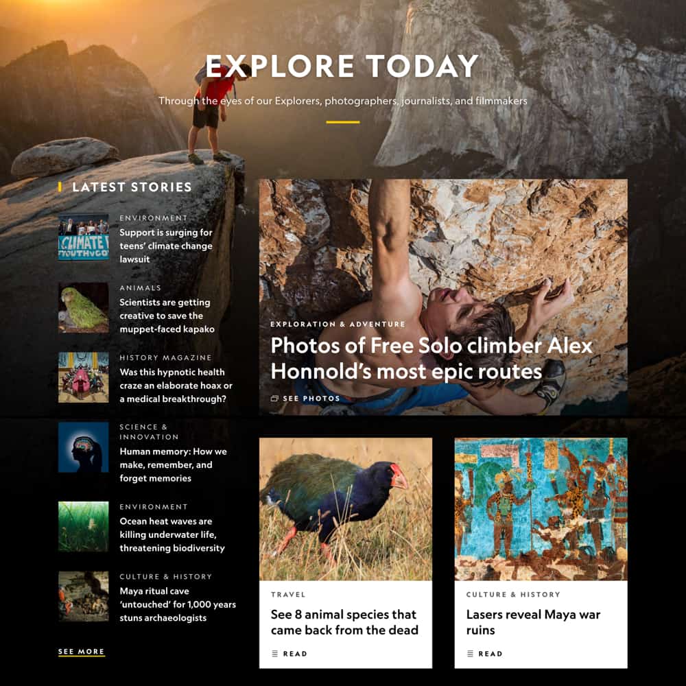
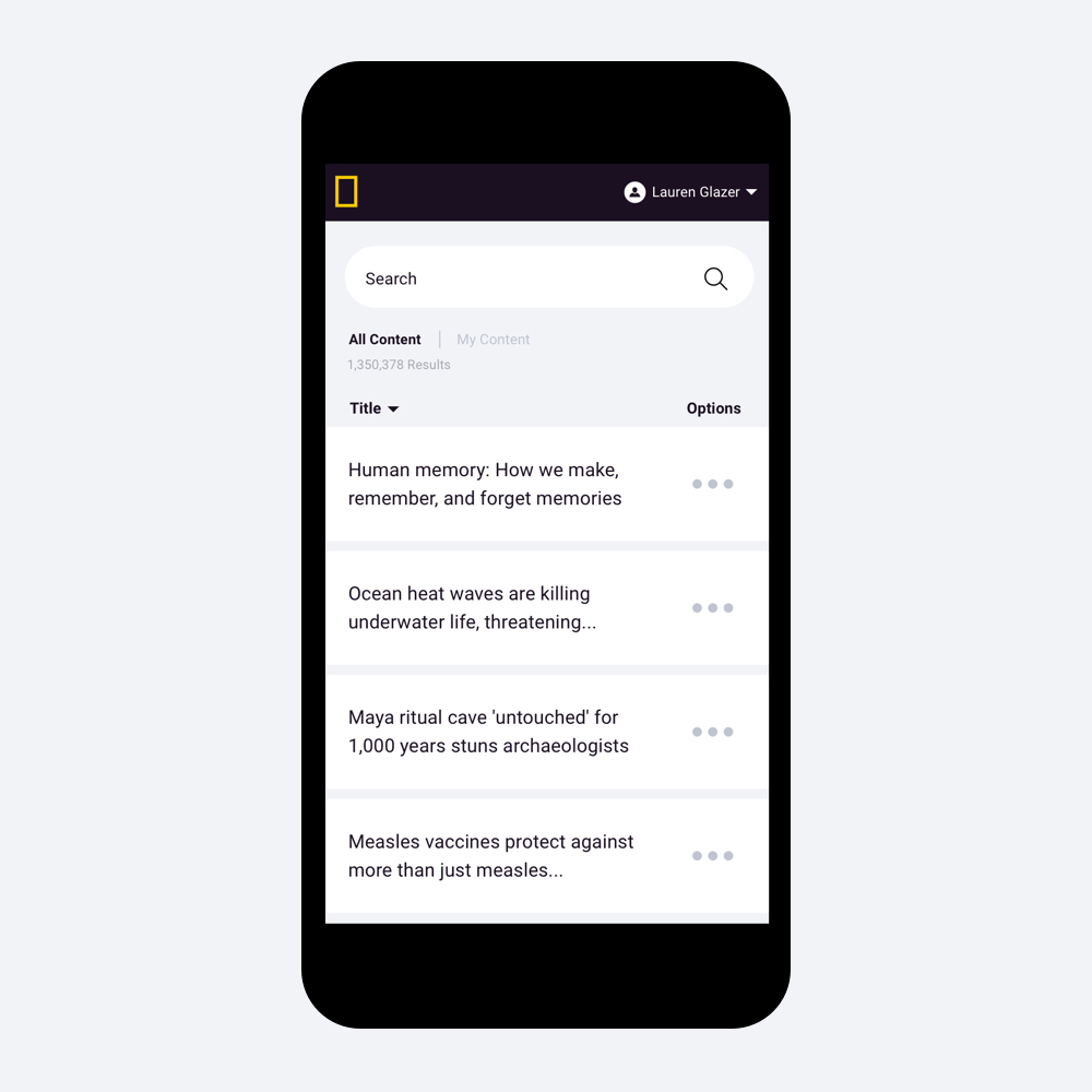
Final Designs
Final Designs
Final Designs
We launched articles as a beta site in July 2017, allowing users to opt-in to the new design. This allowed us to gather analytics and insights while continuing work on the rest of the site sections. The full site was launched in January 2018 for the 130th anniversary of National Geographic. See some of our final designs below, and visit the full site to see it in action!
We launched articles as a beta site in July 2017, allowing users to opt-in to the new design. This allowed us to gather analytics and insights while continuing work on the rest of the site sections. The full site was launched in January 2018 for the 130th anniversary of National Geographic. See some of our final designs below, and visit the full site to see it in action!
We launched articles as a beta site in July 2017, allowing users to opt-in to the new design. This allowed us to gather analytics and insights while continuing work on the rest of the site sections. The full site was launched in January 2018 for the 130th anniversary of National Geographic. See some of our final designs below, and visit the full site to see it in action!
Results
Results
Results
We've seen great results over the past year with the launch of our new site. Launching first as a beta really gave us the opportunity to continue to iterate on our features, and gather learnings quickly. Below are some of the key improvement metrics we've identified over the past year.
Below are the six big wins we identified to build features towards. These features will be tested in a sandbox development environment with the same stakeholder groups we held interviews with, in order to understand our success in implementing an enhanced UX and providing features that are quick and simple for producers to use.
Below are the six big wins we identified to build features towards. These features will be tested in a sandbox development environment with the same stakeholder groups we held interviews with, in order to understand our success in implementing an enhanced UX and providing features that are quick and simple for producers to use.
20%
Decrease in bounce rate on the homepage
10%
Increase in engagement with photo galleries
5%
Decrease in bounce rate site wide
4X
Increase in referrals to other Nat Geo businesses from the navigation
CONTINUE EXPLORING
Walmart Generative AI Search
Principal Product Designer


Amazon Fashion: Prime Try Before You Buy
Product Design Lead
National Geographic Website Redesign
Senior Product Designer
National Geographic Photo Galleries
Product Design Lead


© 2026 Lauren Glazer